HA history: missing status history
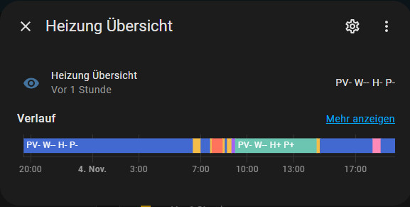
There are some little things about Home Assistant that I can't quite understand. One of these little things is the display of the history diagram when clicking on the details of certain entities. If the entities have neither a numeric nor a binary value, the history shows the changes in color in such a narrow bar that not all values can be read.
Home Assistant currently presents this history data mainly in the form of a history chart. This display provides a graphical overview of the changes over time: for certain entities: sensors with certain values, a graph view is used, so far ok.

For sensors that cannot be displayed in a graph view, the following bar view is used:

Figure: History graph
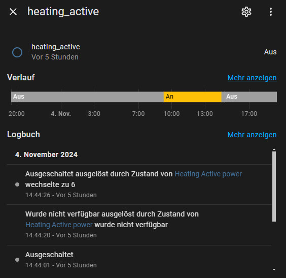
In addition to this view, the logbook is displayed for binary sensors, but not for sensors that use a text as a value, for example.
It would be particularly useful here if the logbook were always displayed for non-numerical values, as is currently the case for a binary sensor:

I have created a pull request for this: https://github.com/home-assistant/frontend/pull/22762
Conclusion
While numerical sensor values are visualized in a graph view and the logbook is used for binary sensors, the display for non-numerical values remains confusing. A narrow, hard-to-read color bar chart is hardly suitable for interpreting data. The integration of a logbook would be particularly helpful for text sensors in order to make changes easier to understand. Overall, Home Assistant could benefit from a more flexible and clearer data presentation that takes all sensor types equally into account.
https://github.com/home-assistant/frontend/pull/22724
 ({{pro_count}})
{{percentage}} % positive
 ({{con_count}})